What Colors and Patterns Work Best for Window Treatments?
When it comes to home décor, window treatments are more than just functional; they’re a cornerstone of style and ambiance. The colors and patterns you choose can dramatically transform a space, making it feel cozy, vibrant, or sophisticated. But what are the best colors and patterns for window treatments, and how do you choose the right ones for your home or office?
Why Are Colors and Patterns Important in Window Treatments?
Colors and patterns in window treatments do more than provide aesthetic appeal—they influence the mood of a room, complement existing décor, and even affect how light interacts with the space. For instance, soft, neutral colors can create a calming atmosphere, while bold patterns can add a touch of personality.
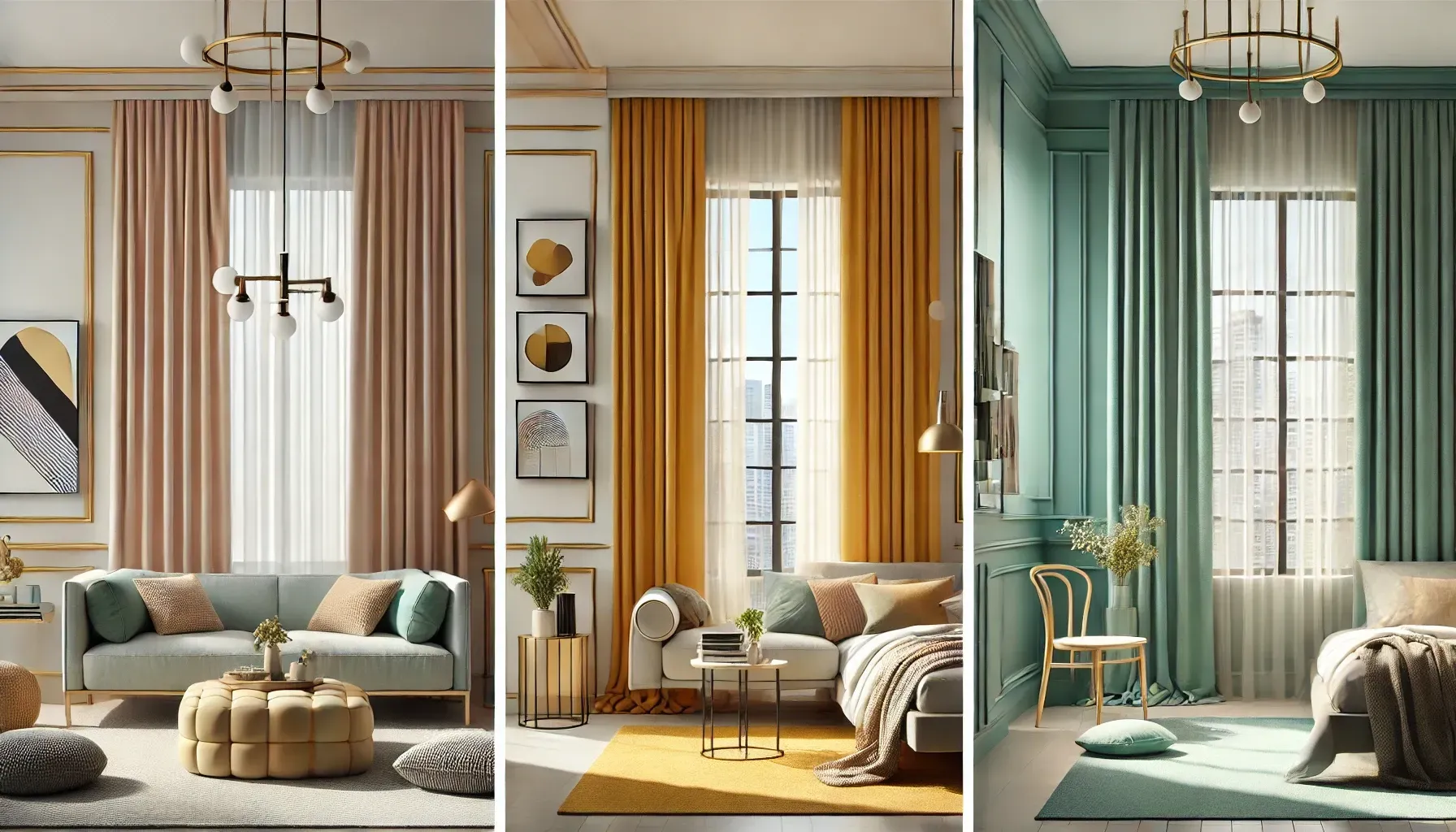
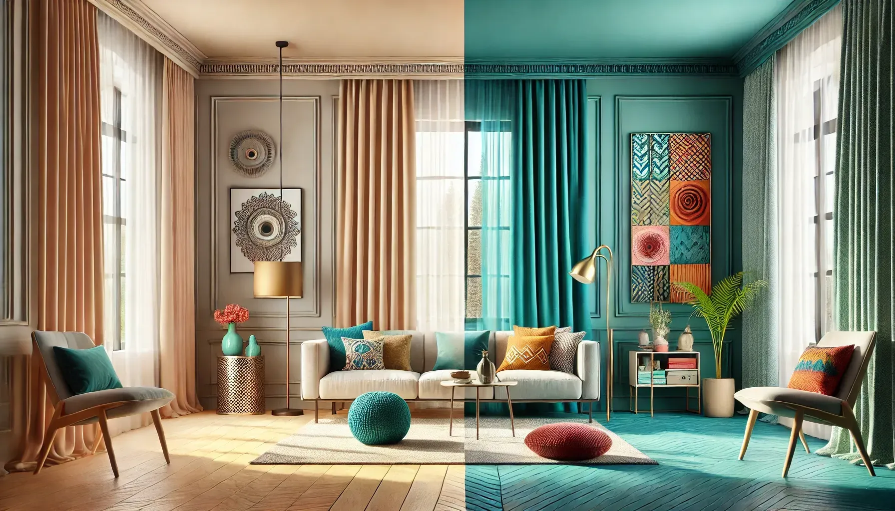
Best Colors for Window Treatments
How to Choose the Right Color for Window Treatments
Selecting the right color depends on the room’s purpose, existing décor, and the ambiance you want to create. Here’s a breakdown:
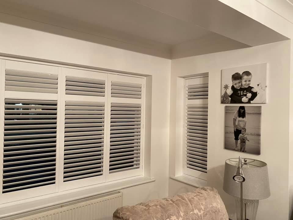
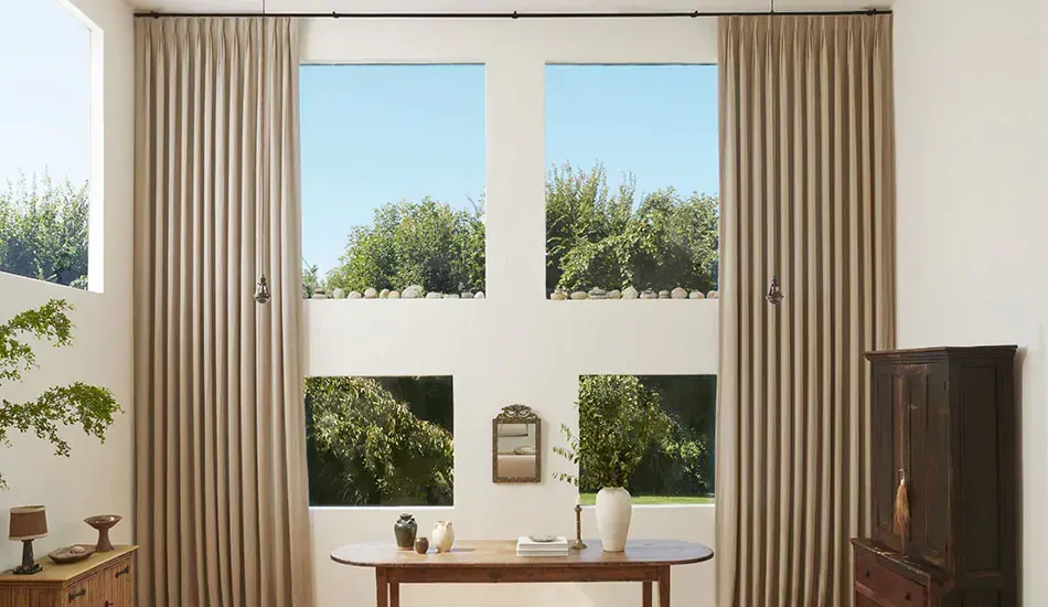
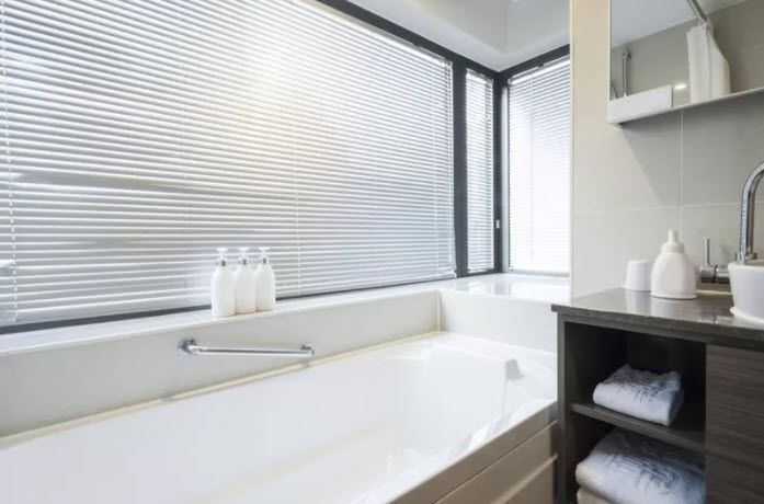
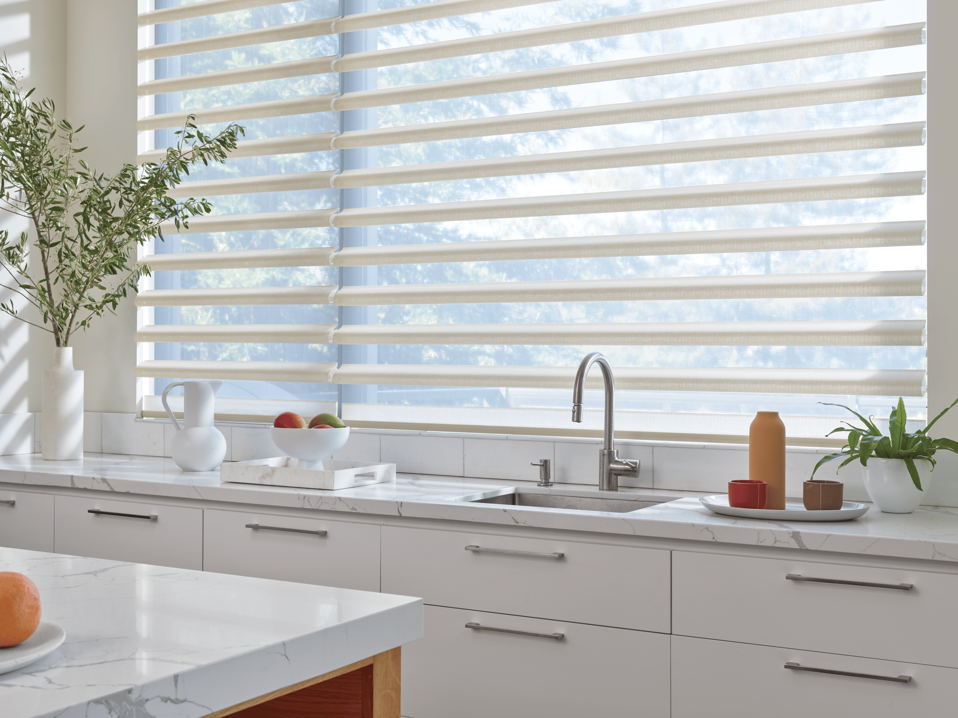
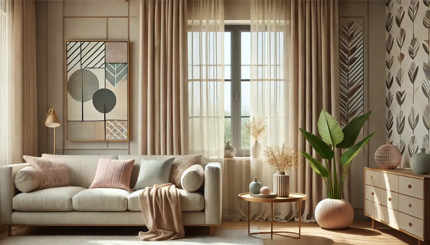
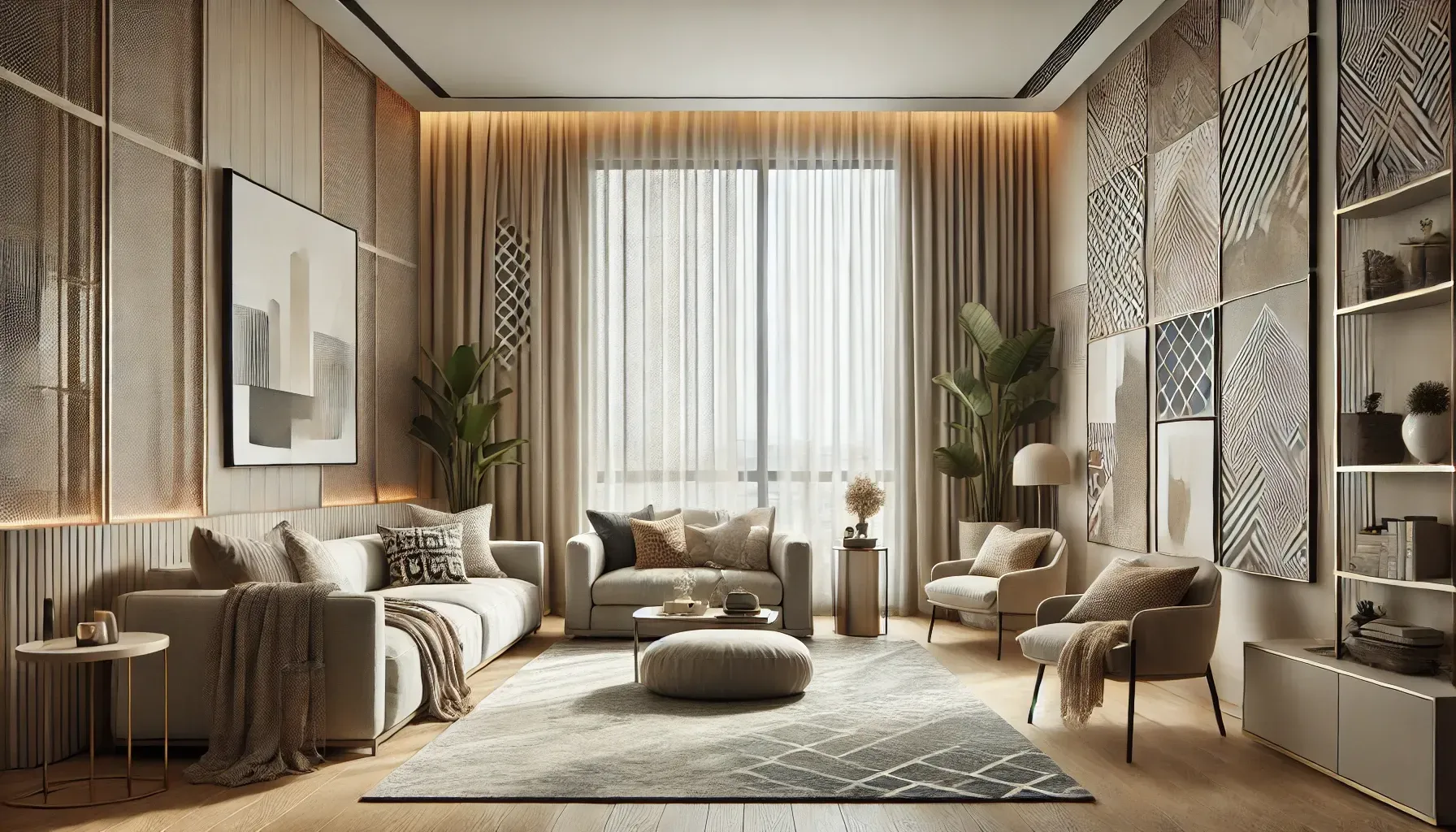
- Neutral Tones: These are classic and versatile. Beige, white, and gray work well in minimalist or modern spaces, blending seamlessly with most furniture and wall colors.
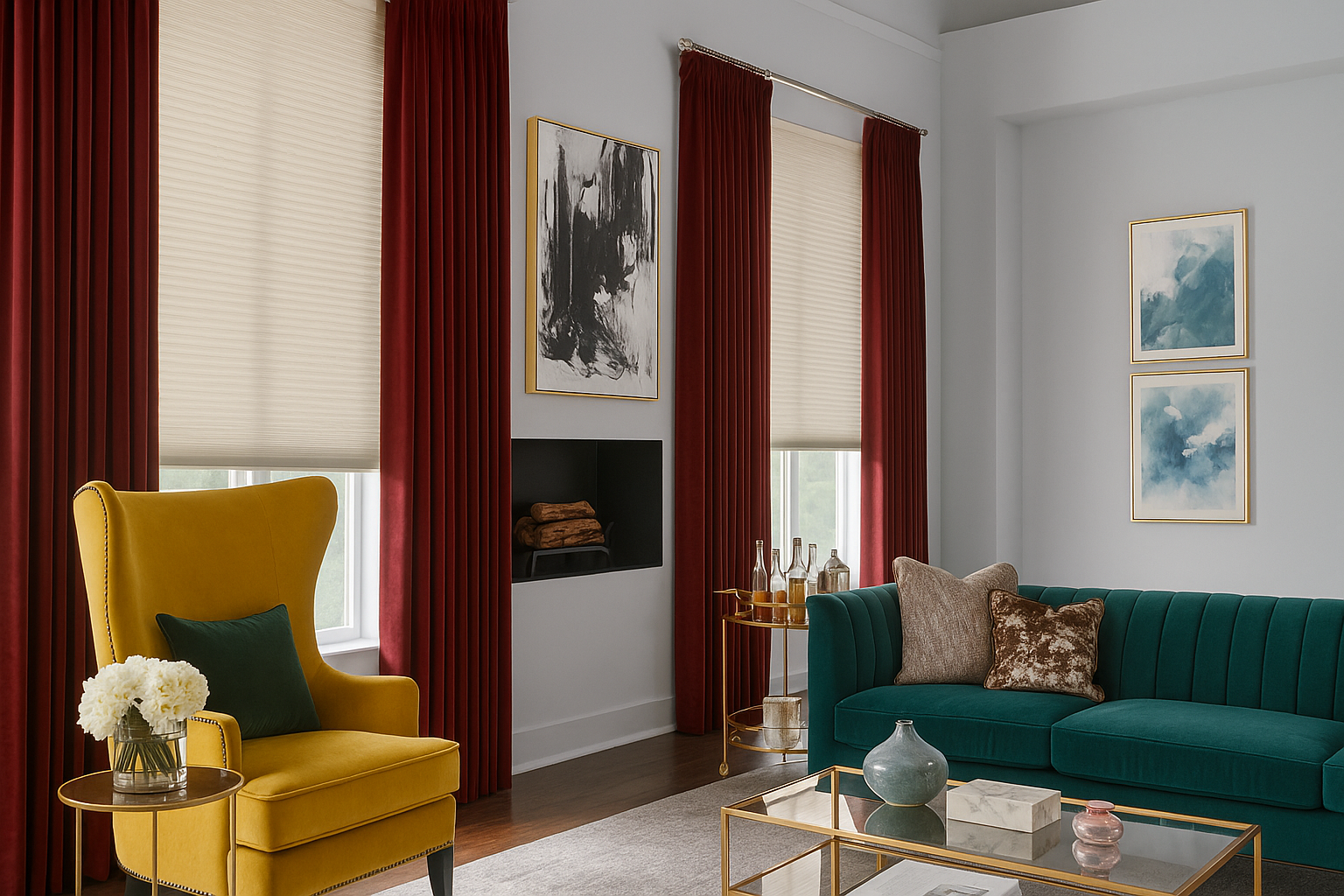
- Bold Hues: If you want to make a statement, consider vibrant colors like teal, mustard yellow, or emerald green. These can serve as focal points in rooms with otherwise muted décor.
- Pastels: Perfect for nurseries or bedrooms, pastel shades like lavender, baby blue, or mint green offer a soothing and serene vibe.
Popular Curtain Colors to Brighten a Room
For darker spaces, lighter colors such as white, cream, or pale yellow can help reflect light and make the room feel airy. In contrast, darker tones like navy or deep burgundy add depth and warmth, ideal for larger rooms.
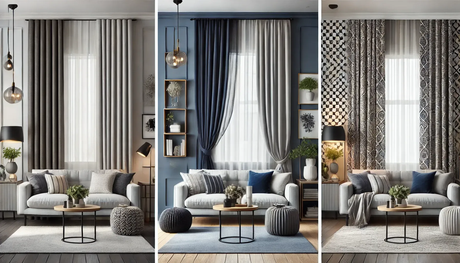
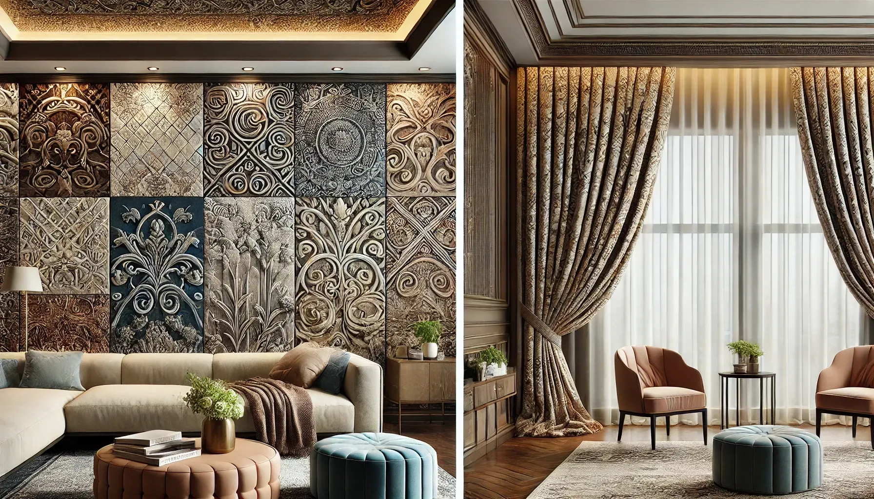
Patterns for Curtains and Blinds
What Are the Best Patterns for Window Treatments?
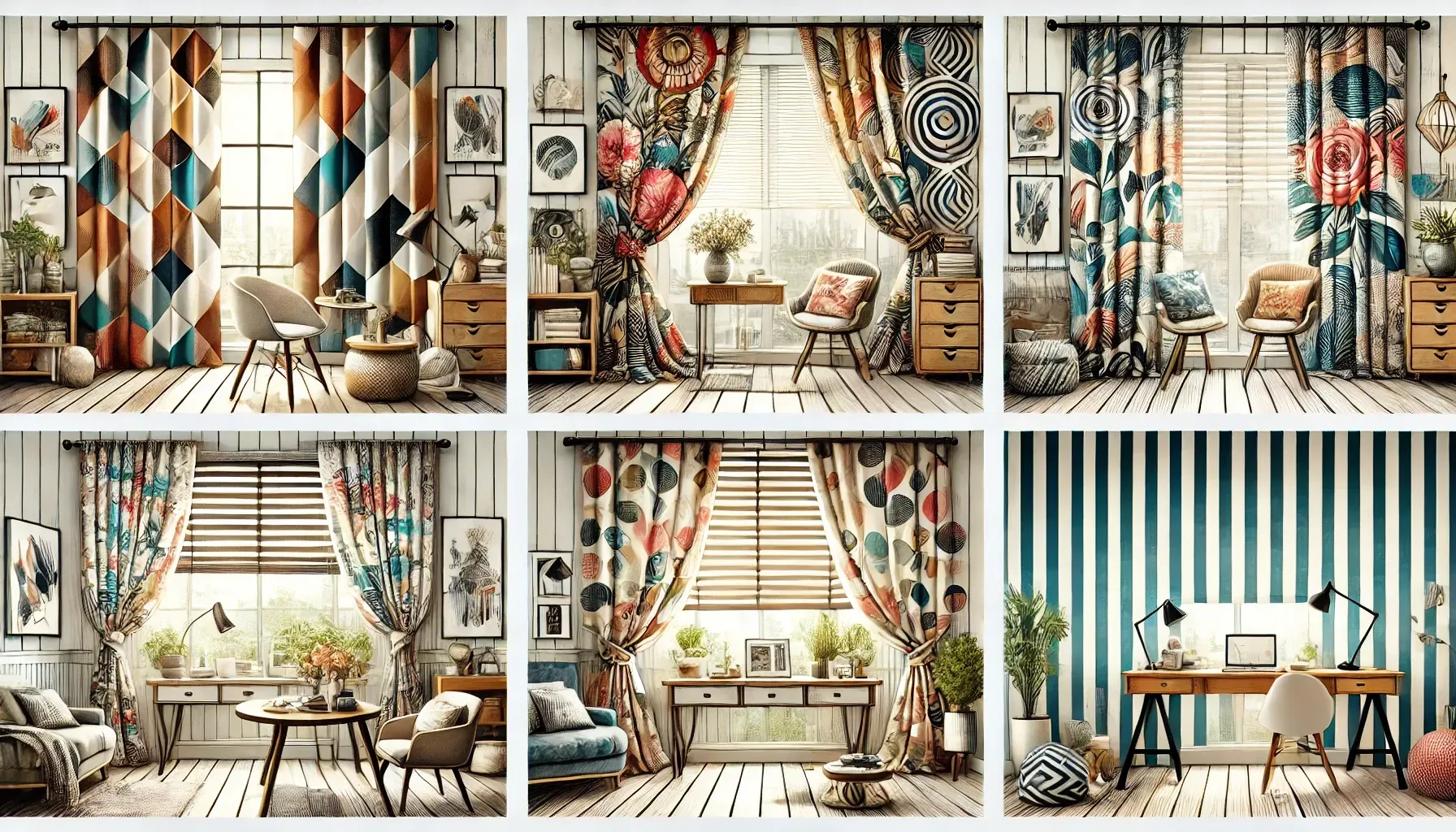
Patterns bring character and dimension to your window treatments. Here are a few options:
- Geometric Patterns: Great for modern interiors, geometric shapes like chevrons, diamonds, or stripes add a contemporary flair.
- Floral Prints: These are timeless and work well in traditional or shabby-chic spaces. Large floral patterns can make a bold statement, while smaller prints offer subtle elegance.
- Abstract Designs: For an artistic touch, abstract patterns provide a unique and modern aesthetic.
- Stripes: Horizontal stripes can make a room appear wider, while vertical stripes add height.
Which Patterns Complement Modern Interiors?
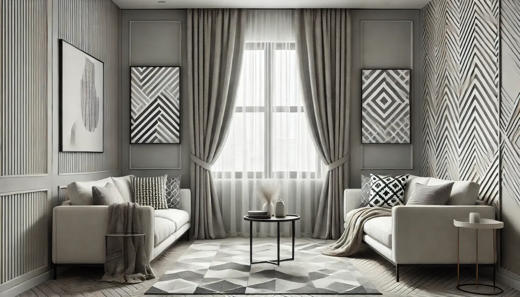
For modern interiors, opt for clean lines and minimalistic designs. Geometric or abstract patterns in neutral or monochromatic palettes are particularly effective.
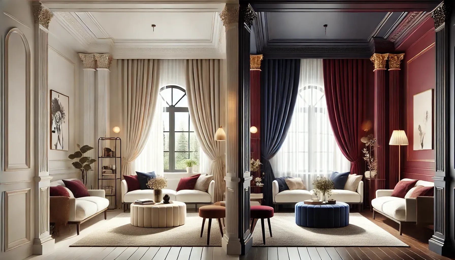
Matching Window Treatments to Décor
How to Match Curtains to Furniture and Walls
Matching window treatments to your furniture and walls ensures a cohesive look. Here’s how to do it:
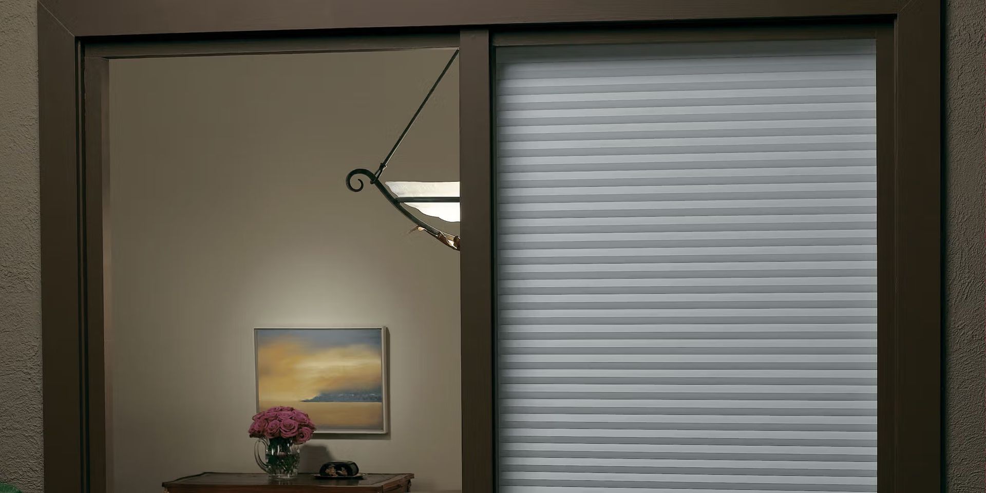
- Monochromatic Schemes: Choose a color similar to your walls for a seamless and sophisticated appearance. For spaces where functionality is key, consider the Benefits of Blackout Blinds to enhance both style and practicality while complementing your decor.
- Contrast: Opt for complementary colors to create a striking visual effect. For example, pair navy curtains with white walls.
- Accents: Use window treatments as an accent by selecting colors or patterns that echo other elements in the room, like throw pillows or rugs.
New Paragraph
Trending Colors and Patterns for 2024
Color Schemes for Blinds in Small Spaces
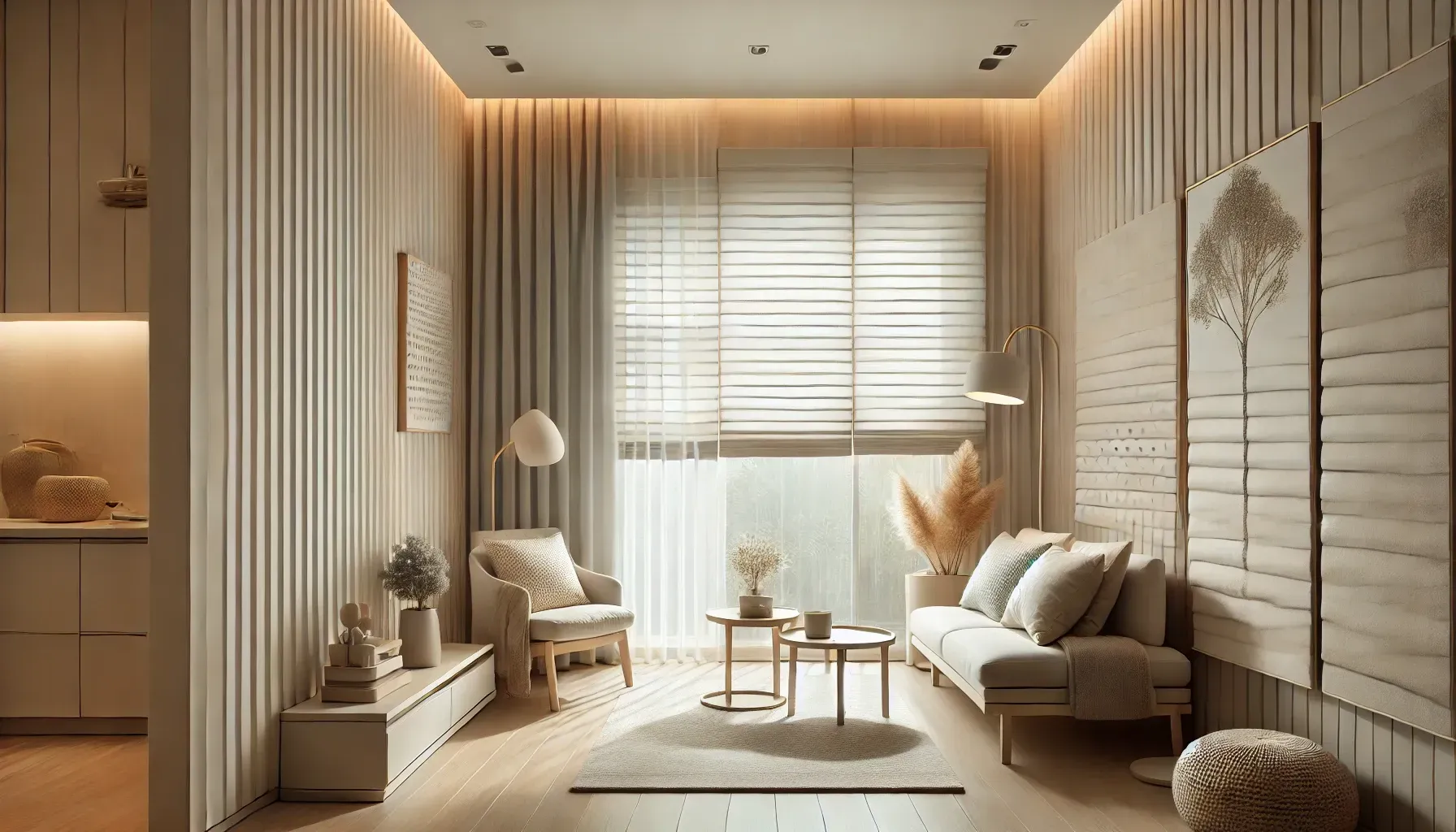
Small spaces benefit from light, neutral colors that create an illusion of openness. Blinds in shades like off-white or light gray are ideal. For a trendy twist, consider adding subtle patterns like soft stripes or dotted prints.
Popular Curtain Colors and Prints for 2024
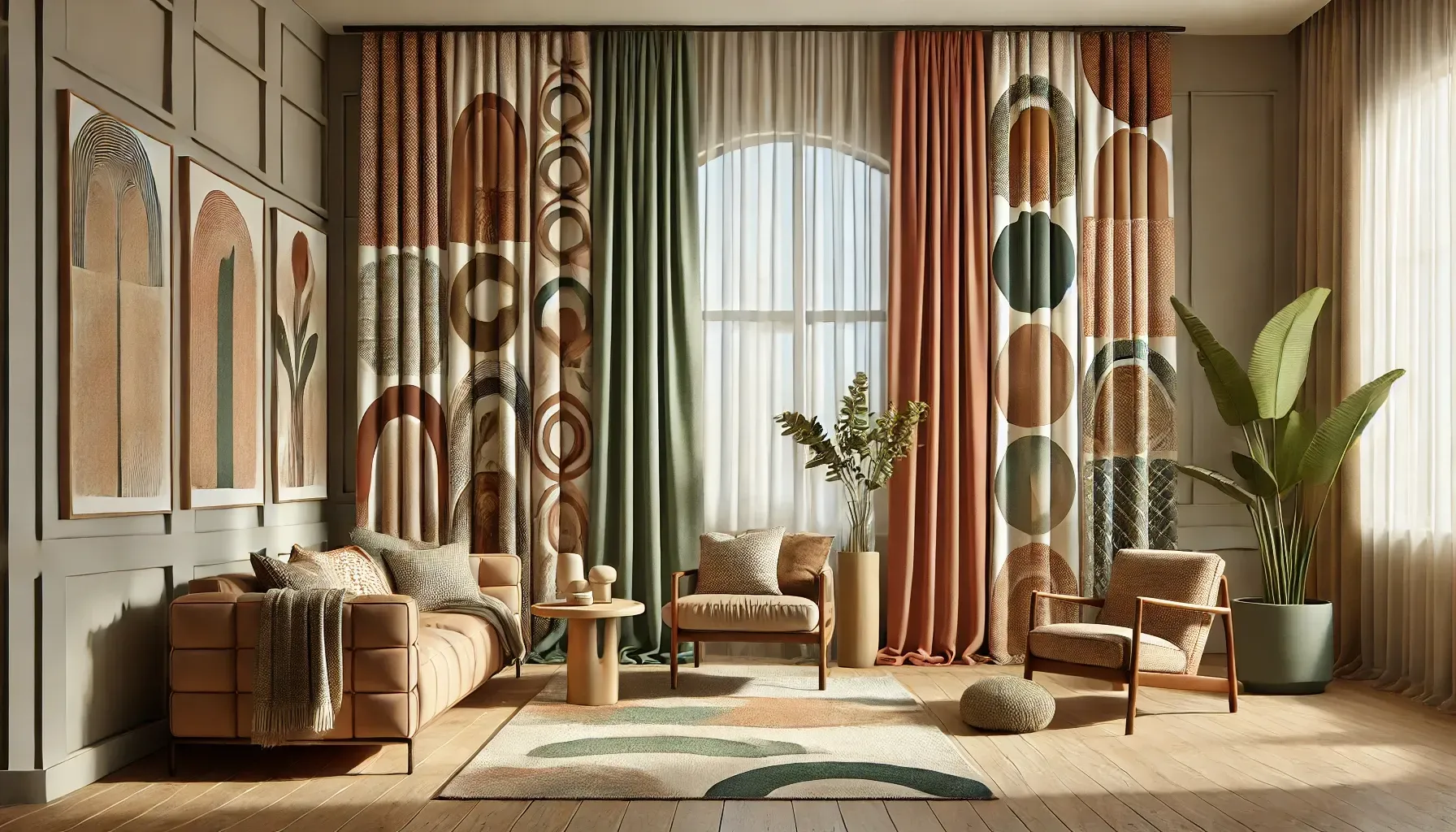
This year, earthy tones like terracotta, sage green, and sandy beige are in vogue. Bold, oversized patterns, including florals and abstract shapes, are also making a comeback.
Layering Window Treatments with Colors and Patterns
Layering involves combining different types of window treatments to achieve a rich and textured look. For example, you could pair sheer, neutral-colored curtains with patterned drapes for a dynamic effect.
Considerations for Choosing Colors and Patterns
Neutral vs. Bold Colors: What Works Best?
Neutral colors are safe and versatile, making them suitable for most spaces. Bold colors, on the other hand, are perfect for rooms where you want to showcase personality and creativity.
Fabric Texture and Pattern Choices
The fabric’s texture can influence how the pattern appears. For instance, silk and velvet add a luxurious feel, while cotton and linen are more casual and laid-back. When selecting window treatments, understanding the differences between Honeycomb or Cotton Fabric can help you decide which material best suits your needs in terms of insulation, durability, and aesthetics.
Psychology of Colors in Window Treatments
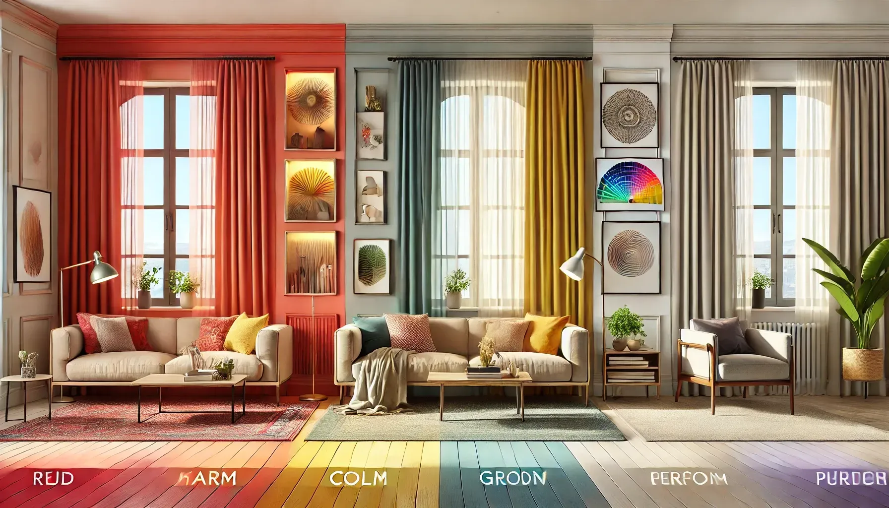
Colors evoke emotions and can set the tone for a room. Consider these insights:
- Warm Colors (Red, Orange, Yellow): Energetic and stimulating, ideal for social spaces like living rooms.
- Cool Colors (Blue, Green, Purple): Calming and soothing, perfect for bedrooms or offices.
- Neutral Colors (Beige, Gray, White): Balanced and timeless, suitable for any room.
Customizing Window Treatment Designs
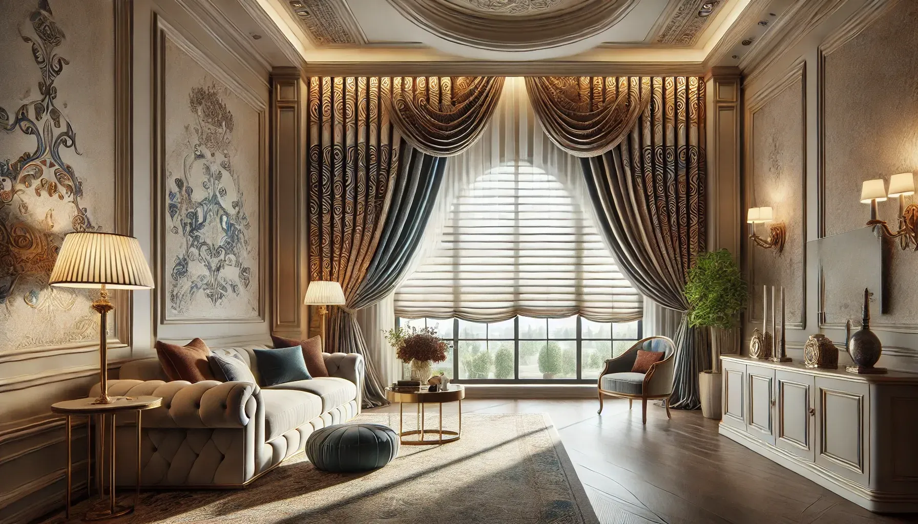
If off-the-shelf options don’t meet your needs, custom window treatments allow you to tailor colors and patterns to your exact specifications. This is especially beneficial for unique spaces or specific design visions.
Conclusion
Choosing the right colors and patterns for window treatments can elevate your home or office, blending functionality with style. Whether you prefer neutral tones for versatility, bold hues for impact, or intricate patterns for character, the key is to align your choice with the room’s purpose and your personal aesthetic.