How to Match Window Treatments with Wall Colors and Flooring
TLDR;
To match window treatments with wall colors and flooring, start by identifying the undertones in your walls and floors. Pair warm floors with warm-toned fabrics and cool floors with cooler shades. Create either contrast or harmony by choosing treatments slightly lighter or darker than the wall, ensuring the entire space feels cohesive and balanced.
The Importance of Coordinating Window Treatments, Wall Colors, and Flooring

Choosing the right window treatments is more than picking what looks pretty. It’s about connecting the visual elements in your home so they feel intentional. Your walls set the tone, your floors ground the space, and your window coverings bridge the two. At Love Is Blinds MI, we help homeowners create this harmony through thoughtful design choices that align tone, texture, and light.
A balanced combination brings:
- Visual flow from floor to ceiling
- A sense of proportion and warmth
Depth and interest through coordinated tones
Understanding Color and Tone in Interior Design

Why Wall Color Matters
Walls are the largest visual surface in any room. They create the backdrop that every other element must complement.
- Light walls make rooms feel open and airy, so deeper or textured treatments help add contrast.
- Dark or bold walls can benefit from softer, neutral window treatments to balance intensity.
- Cool tones (like blues or grays) work best with equally cool shades such as silver, white, or soft charcoal.
- Warm walls (beige, taupe, gold) align with natural fibers, cream, or honey tones.
Always observe how your wall color shifts under different lighting. Natural daylight and artificial light affect tone perception.
The Role of Flooring in Room Design
Your flooring choice influences the warmth and depth of the entire room. Think of it as the anchor.
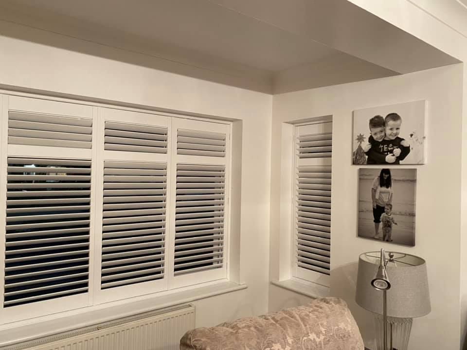
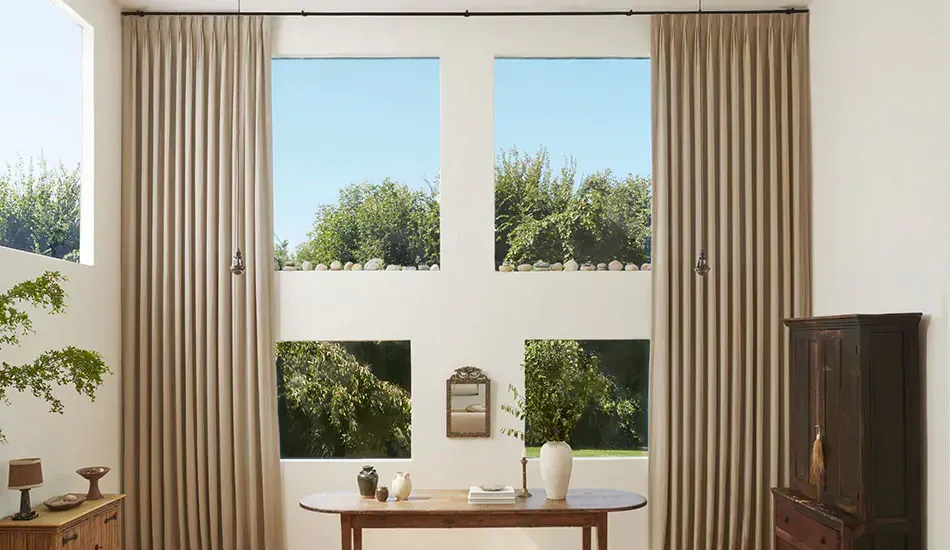
- Hardwood floors introduce texture and natural grain, which pairs well with fabric shades, linen drapery, or woven woods.
- Tile and stone floors lend a sleek, cool surface that suits
roller shades or minimalist blinds.
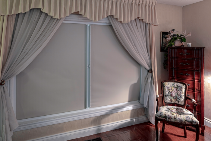
- Carpet adds softness, so structured window treatments like Roman shades help bring balance.
Matching flooring undertones to window fabrics ensures consistency. Warm oak pairs with beige or ivory fabrics, while cool-toned gray floors favor silvers, blues, or white.
Window Treatments as the Bridge Between Elements
Window treatments visually connect your walls and floors. They create balance when selected with tone, material, and proportion in mind.
- Matching tones provide a seamless look.
- Contrasting colors create a focal point.
- Layered textures add depth and sophistication.
Matching Strategies by Flooring Type

Hardwood Floors
Light wood floors (maple, birch, white oak):
- Best with warm whites, creams, or natural
woven shades.
- Adds an organic, inviting tone.
- Avoid overly dark treatments that can feel heavy.
Medium to dark wood floors (walnut, mahogany, espresso):
- Coordinate with mid-toned fabrics such as soft gray, beige, or muted green.
- For contrast, use white or linen drapery.
- Natural fibers like bamboo shades enhance the richness of dark flooring.
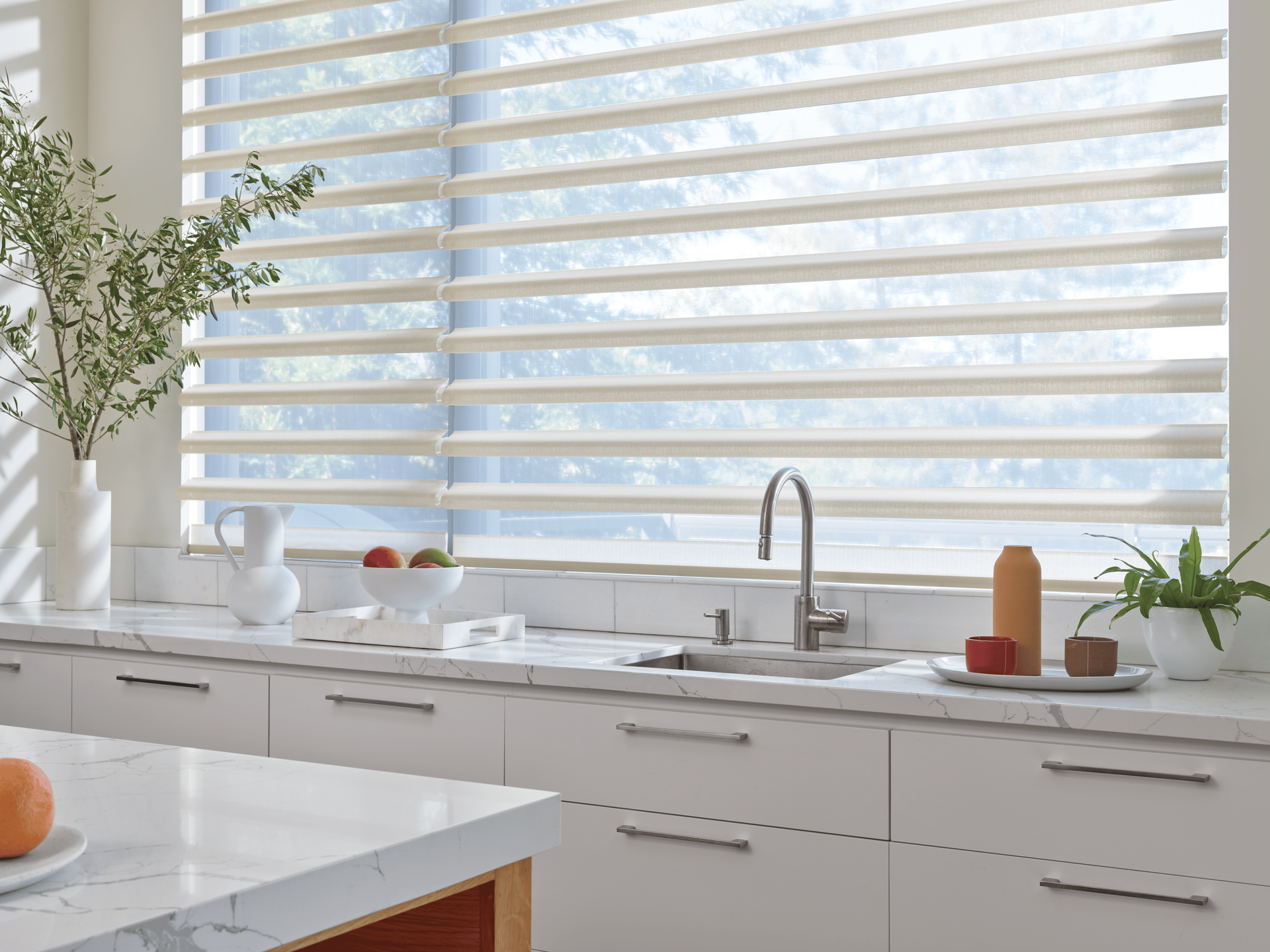
Tile, Stone, or Laminate Flooring
Cool-toned tile (gray, slate, white):
- Complements roller or solar shades in cool neutrals.
- Sheer white or gray curtains keep the look contemporary.
Warm-toned stone (travertine, terracotta, beige):
- Works with natural woven blinds, textured Roman shades, or honey-hued fabrics.
- Avoid overly sleek materials that clash with earthy finishes.
Laminate or LVP (luxury vinyl plank):
- Mimic the floor’s pattern with subtle fabric weaves.
- Stick to neutral or slightly contrasting tones to prevent visual monotony.
Carpeted Floors
Neutral carpet (beige, taupe, cream):
- Flexible base that suits nearly any treatment color.
- Works well with both patterned and plain drapery.
Patterned carpet:
- Keep window treatments simple. Choose solid colors to prevent visual clutter.
Plush carpet:
- Contrast with crisp shades or
blinds for structure.
- Textured carpets pair well with sleek Roman shades or simple panels.
Matching Strategies by Wall Color

Neutral Walls
White, beige, and gray walls create flexibility. These tones invite variety.
- Add interest with patterned or textured fabrics.
- Use tone-on-tone layering for subtle sophistication.
- Neutral on neutral works well when textures differ.
Bold or Dark Walls
Deep navy, emerald, or charcoal walls need balance.
- Light or sheer window treatments prevent the space from feeling closed.
- Cream, ivory, or soft gold drapery offers elegant contrast.
- Metallic accents like brass or matte silver enhance luxury.
Warm vs Cool Wall Tones
Warm wall tones (beige, terracotta, taupe):
- Match with warm neutrals, wood blinds, or woven fabrics.
Cool wall tones (blue, gray, green):
- Pair with crisp white, icy gray, or silver-based fabrics.
Using undertones to guide choices ensures your design feels intentional, not accidental.
Style, Texture, and Material Coordination

Aligning with Your Home’s Design Style
Each style demands its own rhythm of texture and tone.
- Modern or minimalist: sleek roller shades, monochromatic palettes.
- Traditional: layered drapery, pleated panels, or Roman shades.
- Rustic or farmhouse: woven woods, linen, and warm neutrals.
- Eclectic: bold patterns or two-tone curtains paired with simple flooring.
Using Texture and Layering for Depth
Layering creates balance and flexibility.
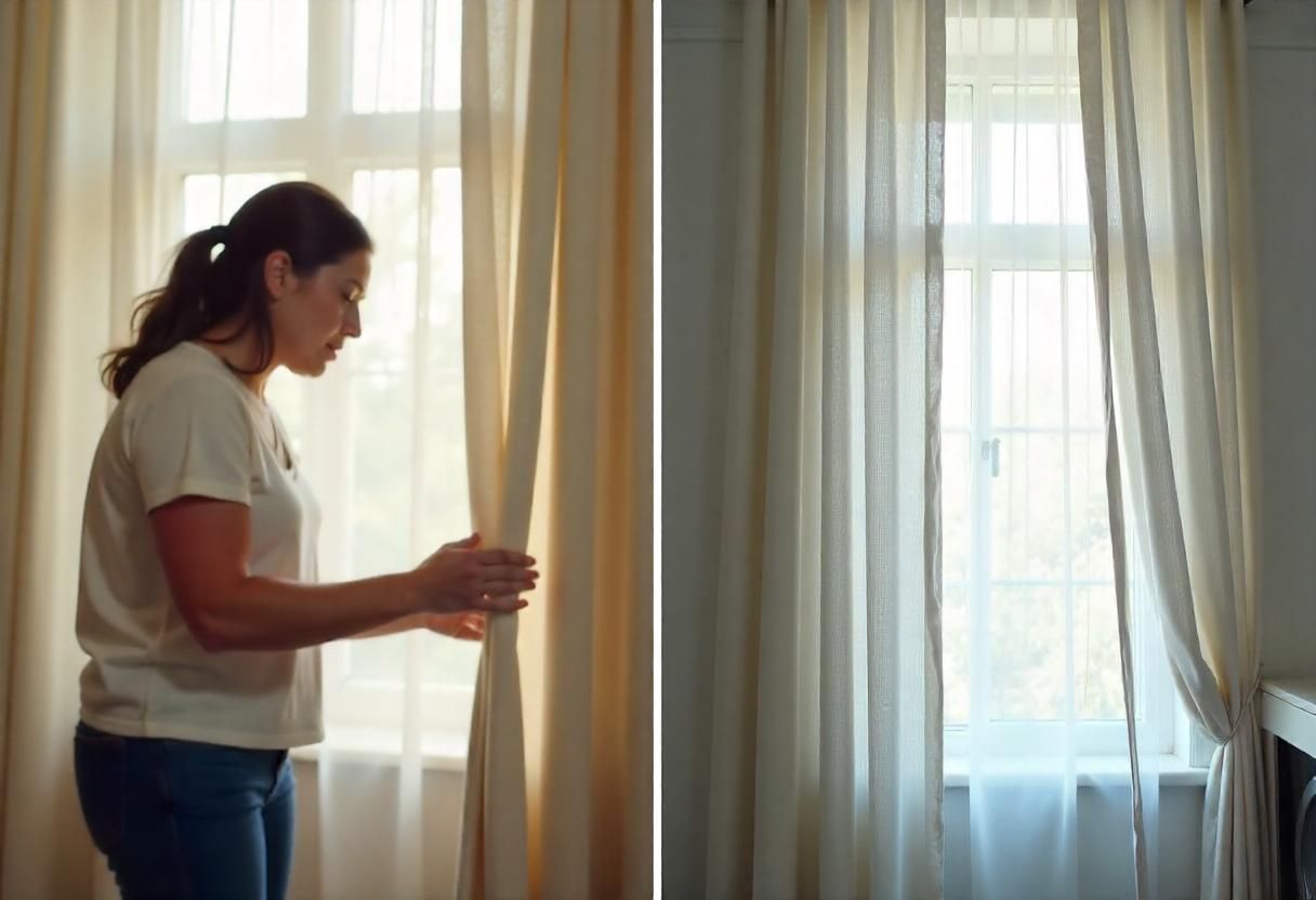
- Combine sheer curtains with blackout panels.
- Pair woven blinds with fabric drapery for warmth and contrast.
- Use alternating materials to echo the natural variation in flooring.
Texture adds tactile interest, tying together different surfaces in one cohesive story.
Balancing Function and Aesthetics
Every room needs both beauty and performance.
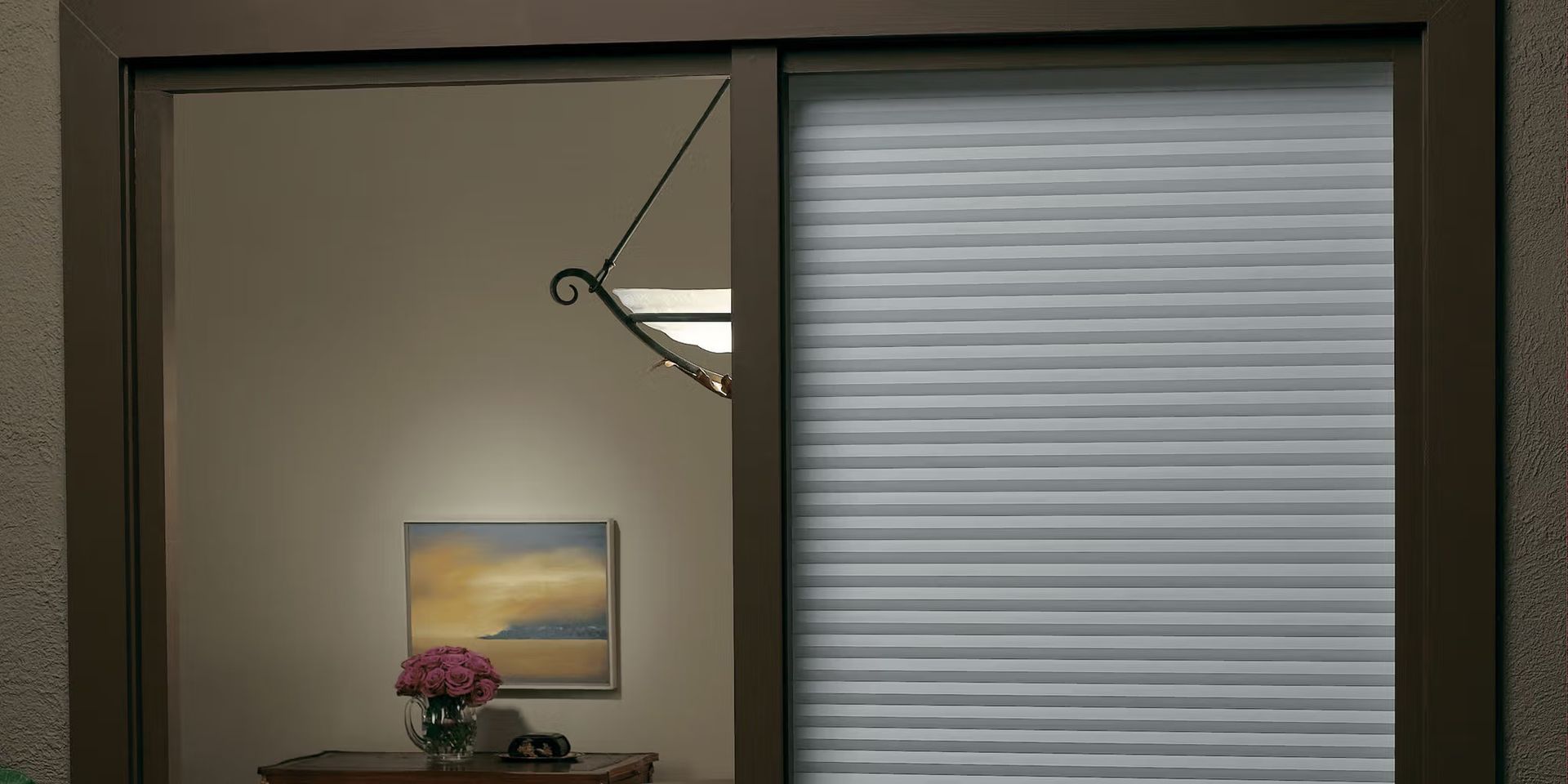
- Light control: choose cellular or roller shades.
- Privacy: use lined drapery or layered treatments.
- Energy efficiency:
honeycomb or thermal shades add insulation.
Function supports form. Choosing practical materials ensures your design stands the test of time.
Practical Tips for Visual Balance

- Follow the “rule of three”: mix no more than three dominant colors in one room.
- Use contrast wisely: dark floors, light drapes; light floors, medium drapes.
- Sample fabrics in natural light to see how tones shift during the day.
- Align your curtain rods or blinds with window trim for consistency.
- Repeat colors across decor elements like throw pillows, rugs, or furniture.
Room-Specific Examples

Living Room
Light oak floors and soft gray walls create an airy base.
- Add warm linen drapery to introduce softness.
- Woven wood blinds complement organic textures.
- Avoid metallic or overly sleek materials that disrupt the calm atmosphere.
Bedroom
Dark wood floors with a deep blue accent wall call for layered comfort.
- Combine blackout curtains with sheer panels for depth.
- Use soft beige or ivory tones for contrast and warmth.
- Add tactile interest with a linen finish or embroidered edge.
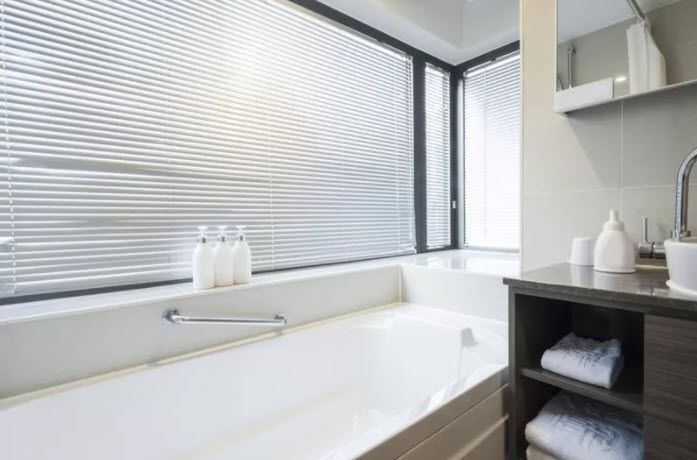
Kitchen or Bathroom
Tile or stone floors with white or neutral walls demand practicality.
- Choose moisture-resistant materials like faux wood blinds or roller shades.
- Light-filtering shades maintain brightness.
- Keep colors light to reflect natural light and prevent heaviness.
Common Mistakes and How to Avoid Them

- Matching everything exactly the same color removes depth. Use variations of tone instead.
- Ignoring flooring undertones creates imbalance. Always compare samples.
- Overusing patterns overwhelms the eye. Choose one statement surface only.
- Forgetting hardware leads to mismatched finishes. Coordinate rods and rings with other fixtures.
- Avoid assuming all neutrals match. Warm gray and cool gray clash when paired carelessly.
Creating Harmony with Love Is Blinds MI

At Love Is Blinds MI, we help clients bring rooms together with cohesive design and professional insight. Matching window treatments with wall colors and flooring is about balance, tone, and texture.
To summarize key steps:
- Identify undertones in your walls and floors.
- Choose contrast or harmony depending on your style preference.
- Test samples in natural light.
- Layer textures for a tailored finish.
- Align materials with your room’s purpose.
A well-coordinated space feels effortless. With the right guidance and quality window treatments, your home can achieve that seamless harmony between wall, floor, and window.